Today I spent yet another day ensconced in the print room, this time creating the final outcome for this project; a series of prints each with the same style and illustration but each with different colours. After playing around in the print room earlier in the week, I had discovered that my original sign post drawing did not translate particularly well into print. I messed around with a few things on paper but frankly wasn't best pleased.
After that I used the colours from my worksheets with the city-scape that I had randomly thrown in and while I liked it, my tutor thought it was plain and that I could achieve more. So, using the same city-scape I thought it would work to try different colour rectangles behind each building. I messed around with this a bit, and made this sample.
I I liked it! And so I used this as the basis for my series, re-creating the same print with different colour rectangles and backgrounds.


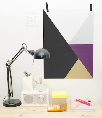
What do you think? I'm pretty happy with it's 50's style and think it could work perfectly for some bedding or wallpaper. Jane (tutor) is urging me to pick a product to give the project more focus but I think it would work for either and can't decide! However I do think that it would be best suited, on a white background for wallpaper in an office and that as bedding it would be best for kids, teens and young adults in all colours. I like them all! In terms of taking it further though, if it were to be say, bedding, I can see that it could be a style sold by Ikea, H&M or another similar company; young, affordable and vibrant with lots of patterns on offer. Ikea often does this style of bright textile as bedding, and tends to run it in a range so you could buy a one off cushion, a bed set, a curtain or just the fabric. Perhaps they could hire me and add wallpaper into their catalogue ;)!?
Next week I will be beginning another short project based on the mood board I shared earlier this week, and am intrigued to see how it goes! In order to move onto this project, and the next one, I need to think about what I think was and wasn't successful and what I will take with me into future work.
And so I made a list! (I love lists!)
What I liked:
- using thin pen illustrations as the pattern
- bright colours!
- shapes and stripes!
- rough scrawly style of my drawing
- bedding and wallpaper :)
- having a range of ideas suitable for all sorts of products
- flat style of pen and ink work on paper (rather than using textures or fabric)
- working with thin fabric to translate the flat style of work. (silk or thin organza)
What I didn't like:
- dragging out worksheet and development process
- jumping from one colour scheme to another without a smooth transition
- how most of my patterns aren't well repeated or tessellated.
- not being able to create individual prints, and feeling pressured to create a pattern. (I like one off prints and designs and often see lovely ones in shops. I feel that my taste is possibly too commercial for an art course?)


